Compose Previews & Preview Parameters
Jetpack Compose previews are a powerful tool for rendering your app's UI in the IDE in realtime¹.
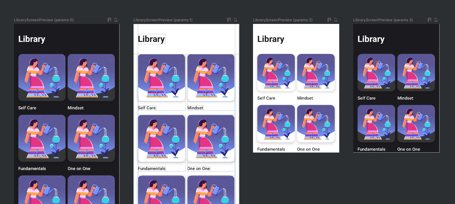
Compose Previews
Say you have the following Composable:
@Composable fun CustomText(text: String) {
    Text(text = text)
}
You can preview this composable, like so:
@Preview
@Composable
fun CustomTextPreview() {
    CustomText(text = "Wow, a preview!")
}
Which will render a preview of your composable, in the IDE 'design' tab:
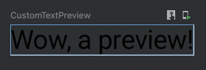
Ew. Let's see what this might look like on an actual screen, by adding a Scaffold around our preview content:
@Preview
@Composable
fun CustomTextPreview() {
    Scaffold {
        CustomText(text = "Wow, a preview!")
    }
}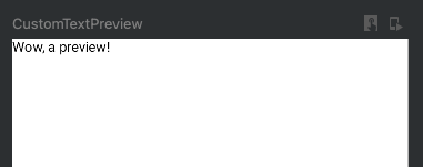
That's right, you can wrap your Preview content in other Composables!
Preview Annotations
What if we want to see this preview in dark mode? Compose Previews accept annotation arguments such as device, showBackground, uiMode, name, group, apiLevel, showSystemUI, fontScale and a bunch of others. There's a UI in the IDE for setting these.
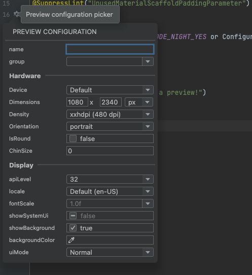
Font Scale
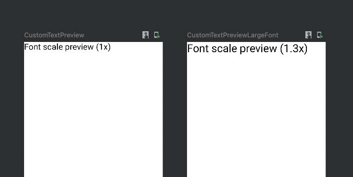
I find fontScale to be a particularly useful parameter, for quickly previewing whether text content is cut off.
Dark mode
Let's try setting showBackground=true and uiMode=night:
@Preview(
    showBackground = true,
    uiMode = Configuration.UI_MODE_NIGHT_YES
)
@Composable
fun CustomTextPreview() {
    Scaffold() {
        CustomText(text = "Wow, a preview!")
    }
}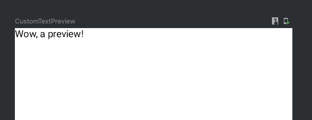
Wait a minute, that looks the same. Where's my dark mode?
Well, we haven't actually instructed the CustomText composable, nor the CustomTextPreview to be aware of the theming system. Let's render the preview content inside a theme-aware Composable:
@Composable
fun MyTheme(
    isDark: Boolean = isSystemInDarkTheme(),
    content: @Composable () -> Unit
) {
    val colors = if (isDark) {
        DarkColorPalette
    } else {
        LightColorPalette
    }

    MaterialTheme(
        colors = colors,
        typography = Typography,
        shapes = Shapes,
        content = content
    )
}
@SuppressLint("UnusedMaterialScaffoldPaddingParameter")
@Preview(
showBackground = true,
uiMode = Configuration.UI_MODE_NIGHT_YES
)
@Composable
fun CustomTextPreview() {
MyTheme {
Scaffold {
CustomText(
text = "Wow, a preview!",
color = MaterialColors.onBackground
)
}
}
}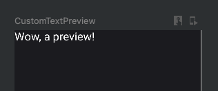
My man. Lookin' good.
Multiple Previews
Another handy thing you can do with previews, is render multiple of them. Like so:
@Preview(device = Devices.NEXUS_5)
@Composable
fun CustomTextPreviewNexus5() {
    ...
}


@Preview(device = Devices.PIXEL_3)
@Composable
fun CustomTextPreviewPixel3() {
    ...
}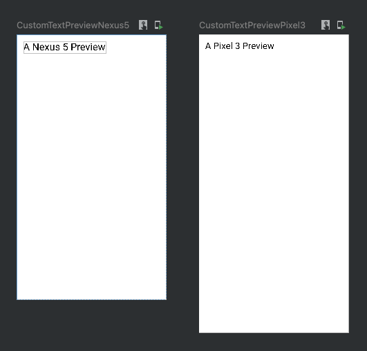
You can add as many previews as you like.
Composing Previews
We touched on this earlier - but remember, your Previews are Composable functions themselves. This means you can leverage the power of Compose, and nest your Preview inside of other Composables. For example, let's say you want to always render your preview in a Box, in a Scaffold, with a default padding of 16.dp, and a customisable background colour:
@Composable
fun PreviewWrapper(
    backgroundColor: Color = Color.Transparent,
    content: @Composable () -> Unit
) {
    Scaffold(
        backgroundColor = backgroundColor
    ) { padding ->
        Box(
            modifier = Modifier
                .padding(padding)
                .padding(16.dp)
        ) {
            content()
        }
    }
}
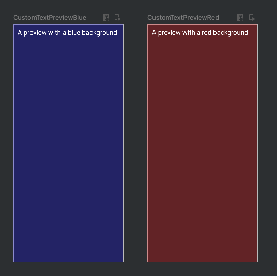
Now, let's write a Preview for each background colour we want to see:
@Preview
@Composable
fun CustomTextPreviewBlue() {
    PreviewWrapper(backgroundColor = Color.Blue.copy(alpha = 0.25f)) {
        CustomText(
            text = "A preview with a blue background",
            color = Color.White
        )
    }
}

@Preview
@Composable
fun CustomTextPreviewRed() {
    PreviewWrapper(backgroundColor = Color.Red.copy(alpha = 0.25f)) {
        CustomText(
            text = "A preview with a red background",
            color = Color.White
        )
    }
}
Neat-o!
Preview Parameters
All this preview functionality is really great, but.. a normal project contains a lot of composables, and we don't really want to have to define multiple @Preview(...) for every possible configuration that we would like to see each Composable rendered in. There must be a better way!
Enter PreviewParameter.
The PreviewParameter annotation, and PreviewParameterProvider<T> interface allow us to define a sequence of values (like a list), which are passed into a single @Preview definition. The IDE will then generate a preview for each value in the sequence.
Dark/Light theme provider
Let's generate a preview for both the light and dark themes.
First, let's say our app's content is rendered inside of a theme Composable that looks like so:
@Composable
fun MyTheme(
    isDark: Boolean = isSystemInDarkTheme(),
    content: @Composable () -> Unit
) {
    MaterialTheme(
        colors = if (isDark) DarkColorPalette else LightColorPalette,
        content = content
        ...
    )
}
We'll define aPreviewParameterProvider, which returns a sequence of Boolean, one for each Preview that will be rendered:
class DarkThemeProvider : PreviewParameterProvider<Boolean> {
    override val values: Sequence<Boolean>
        get() = sequenceOf(
            true, // dark
            false // light
        )
}
Now let's pass this into our Preview:
@Preview
@Composable
fun CustomTextPreview(
    @PreviewParameter(DarkThemeProvider::class) isDark: Boolean
) {
    MyTheme(isDark = isDark) {
        PreviewWrapper(
            backgroundColor = MaterialColors.background
        ) {
            CustomText(
                text = "A preview with colors determined by the PreviewParameter",
                color = MaterialColors.onBackground
            )
        }
    }
}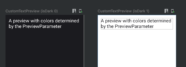
We get two previews for the price of one! You could probably move MyTheme into PreviewWrapper, and pass isDark to the wrapper, to reduce some of the boilerplate.
Now.. you might say that this is a lot of work just so you don't have to write a preview twice. But - we can reuse the DarkThemeProvider in all of our other previews as well. What if our sequence returns 10 different variants? That's 10 previews you don't have to write, per Composable. Best of all, we can get really creative with which types the PreviewParameterProvider returns.
ViewState Provider
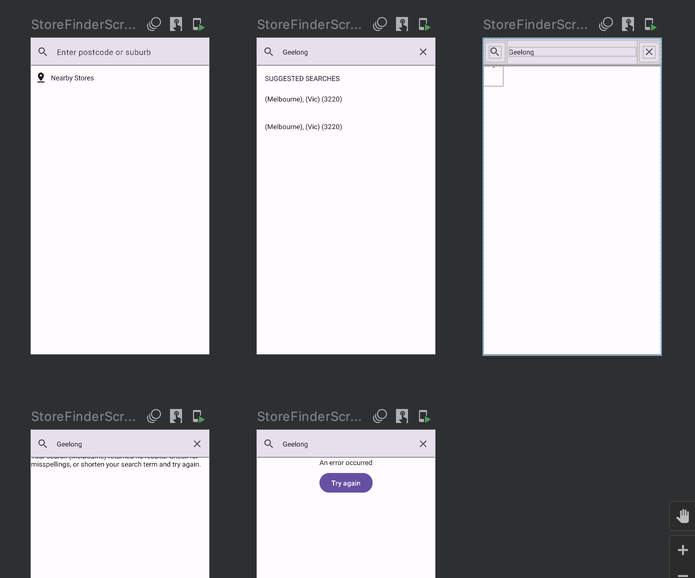
My favourite version of this lately, is providing different ViewStates for a Composable 'screen':
class ViewStateProvider : PreviewParameterProvider<MyViewState> {
    override val values: Sequence<MyViewState>
        get() = sequenceOf(
            ViewState.Loading,
            ViewState.Success,
            ViewState.Error
        )
}
@Preview
@Composable
MyScreenPreview(@PreviewParameter(ViewStateProvider::class) viewState: ViewState) {
MyScreen(viewState = viewState)
}
Get creative!
There's really no limit to this. Return a matrix of ViewState and Theme. Or, a class representing device dimensions, which renders the preview at the exact width & height you desire. Mixing the PreviewParameter with Composables which then render your content means you can really go to town.
Note: At the time of writing, there is a bug in Android Studio Chipmunk which requires the PreviewParameterProvider class to be public. This is fixed in Electric Eel.
¹ Realtime does not mean the same thing in Android Studio as it does in real life.